Experience & Knowledge
That Set You Apart.
Custom e-commerce solutions built to transform your business. With our End-to-End. E-Commerce Design and Frontend & Backend Development expertise, we combine innovative strategies with deep knowledge and experience to create user-focused online stores that drive growth, boost sales, and set your brand apart.

Platforms We Specialize in


Choosing the right e-commerce platform can be overwhelming, but we’ll help you find the perfect fit for your brand and goals. Our experts assess your needs and guide you to a solution that drives success.
Services Tailored for Your E-Commerce Success
Composable Commerce Tailored For Business.
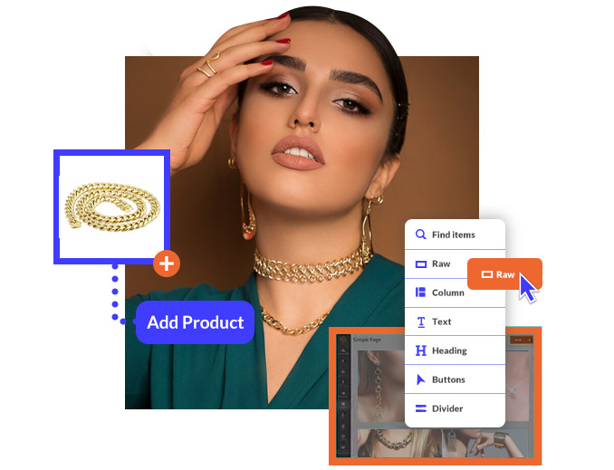
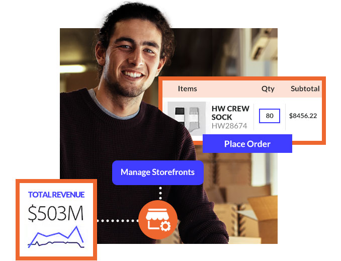
B2B & B2C Solutions

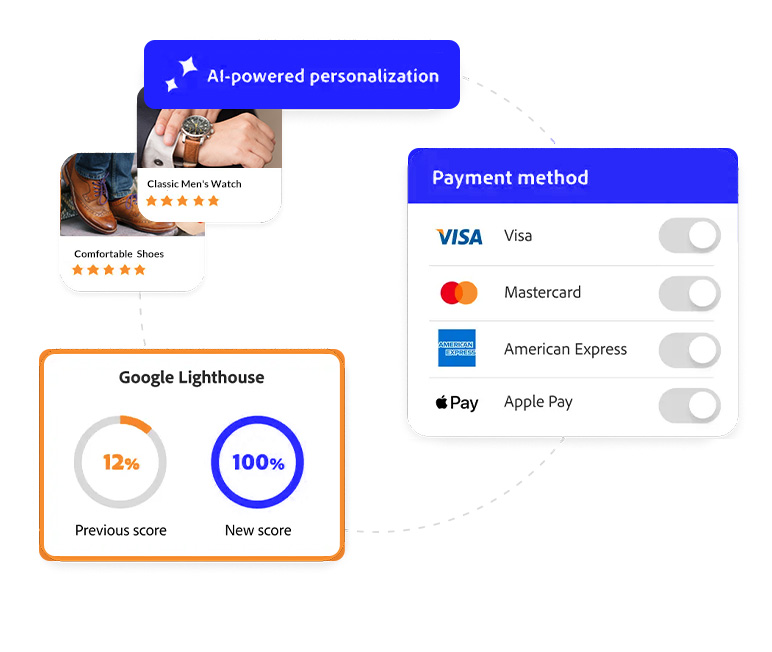
Customizable Solutions for Growth
Empower Teams to Thrive
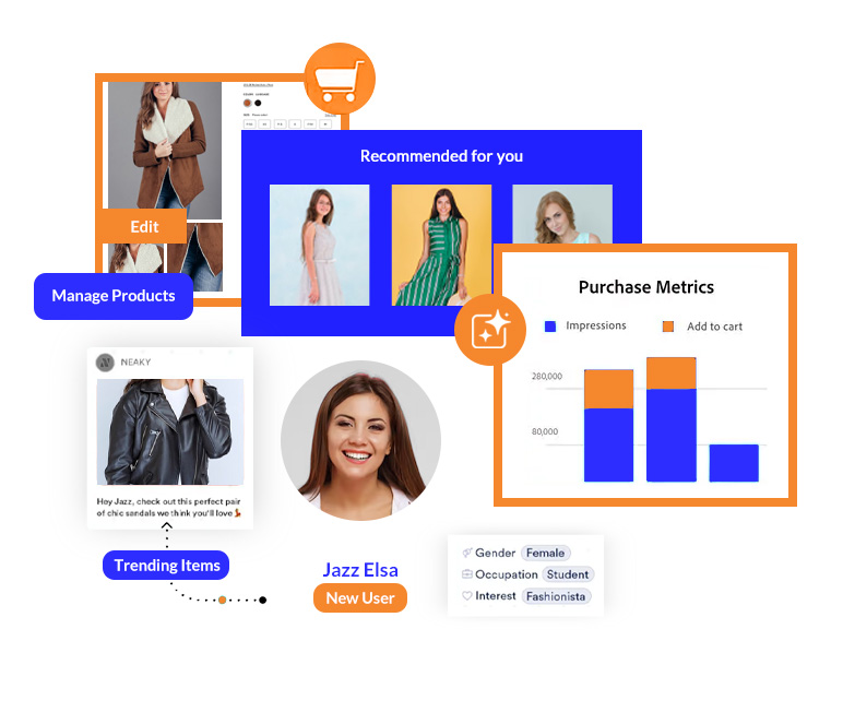
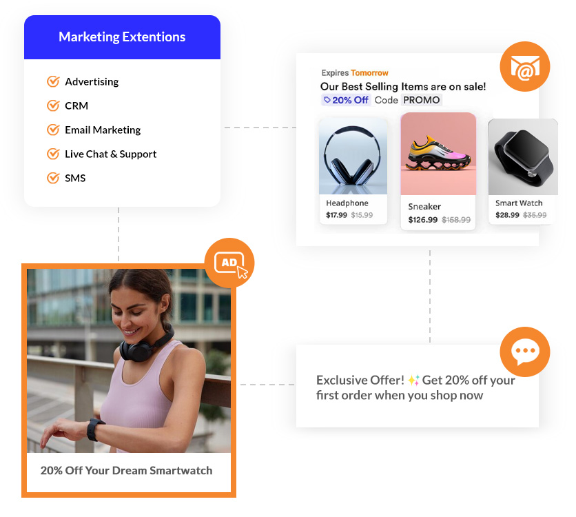
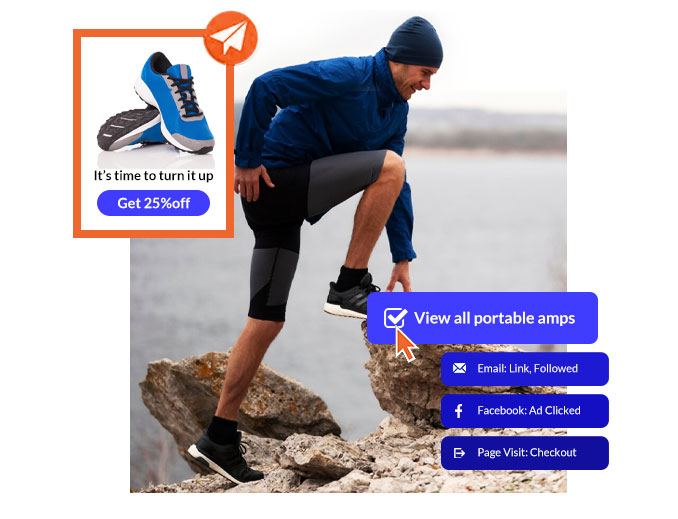
Expand Your Capabilities
Discover apps and tools to customize and streamline your e-commerce operations, from ERP integrations to customer experience solutions.
-
 Easily connect ERP and order management systems to optimize your internal processes.
-
 Integrate marketing and customer service solutions to enhance interactions and boost satisfaction.
-
 Access apps and extensions to expand commerce functionalities and streamline operations.
Support and Maintenance

A Clear Path to Success
We believe in a process that’s as seamless as it is transparent. With open communication and a results-driven approach, we ensure every step aligns with your vision, embodying the trust and professionalism you deserve.

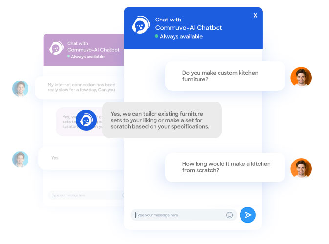
Make AI Your Expert Customer Support Agent
Transform customer service with AI-powered solutions that offer instant, accurate responses and 24/7 support, ensuring smarter workflows and more satisfied customers. Integrating Commuvo AI into your e-commerce strategy boosts efficiency and enhances customer satisfaction.
Learn More AI Chatbots
Streamline support with chatbots that assist customers, guide purchases, and provide instant solutions—keeping users engaged and satisfied.
 AI Messaging
Automate SMS communication with AI, delivering timely and relevant messages that enhance customer engagement while simplifying operational workflows.

E-commerce by the Numbers
Why Brands Need it
Trust Through Design
91% of consumers judge a company's credibility based on the design of its website, making strong visual design essential for building trust.
Mobile Shopping Dominance
Over 60% of online shopping occurs on mobile devices, making responsive and mobile-optimized websites crucial for reaching modern consumers.
Brand Visibility Expansion
63% of consumers discover new brands via e-commerce platforms, offering significant opportunities for brand awareness and market reach.
Multi-Channel Engagement Drives Results
87% of consumers shop across multiple channels, highlighting the importance of having a robust and versatile e-commerce presence.
The Rise of Direct to Consumer Sales
Direct-to-consumer e-commerce sales reached $1 trillion in 2024, illustrating the growing potential for brands to maximize profitability by engaging directly with customers.
Conversion Through Personalization
70% of consumers expect personalized shopping experiences, and brands that leverage data to tailor their approach see up to 40% higher conversion rates.
Find the answers that you need
- Basic online store: 1–2 months
- Custom e-commerce website: 3–6 months
- Complex B2B e-commerce website: 6+ months Timelines depend on unique requirements and are based on our proven workflows for accurate delivery.
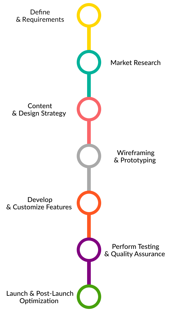
- Define goals & requirements
- Market research & planning
- Content & design strategy
- Wireframing & prototyping
- Develop & customize features
- Perform testing & quality assurance
- Launch & post-launch optimization
- Define goals & requirements
- Market research & planning
- Content & design strategy
- Wireframing & prototyping
- Develop & customize features
- Perform testing & quality assurance
- Launch & post-launch optimization
- Use scalable hosting
- Implement caching strategies
- Optimize database queries
- Use CDNs
- Conduct load testing
- SSL certificates
- Secure payment gateway integration
- Regular updates and security patches
- Code audits and optimization Our team ensures your e-commerce site remains safe and compliant with all security regulations.
- Usability testing
- Performance reviews
- Conversion optimization
- Responsive design for all devices
- Actionable insights for improvement Our focus is on creating fast, user-friendly, and brand-aligned designs.

Let's Build your
E-commerce Success

 Website Design
 E-commerce Solutions
 CMS
CMS Management & Support
